
Quiet Luxury Bedroom on a Budget: The Room That Needed Less
There is no marble fireplace in this bedroom. No custom wardrobe, no designer bed and no view across a private garden.
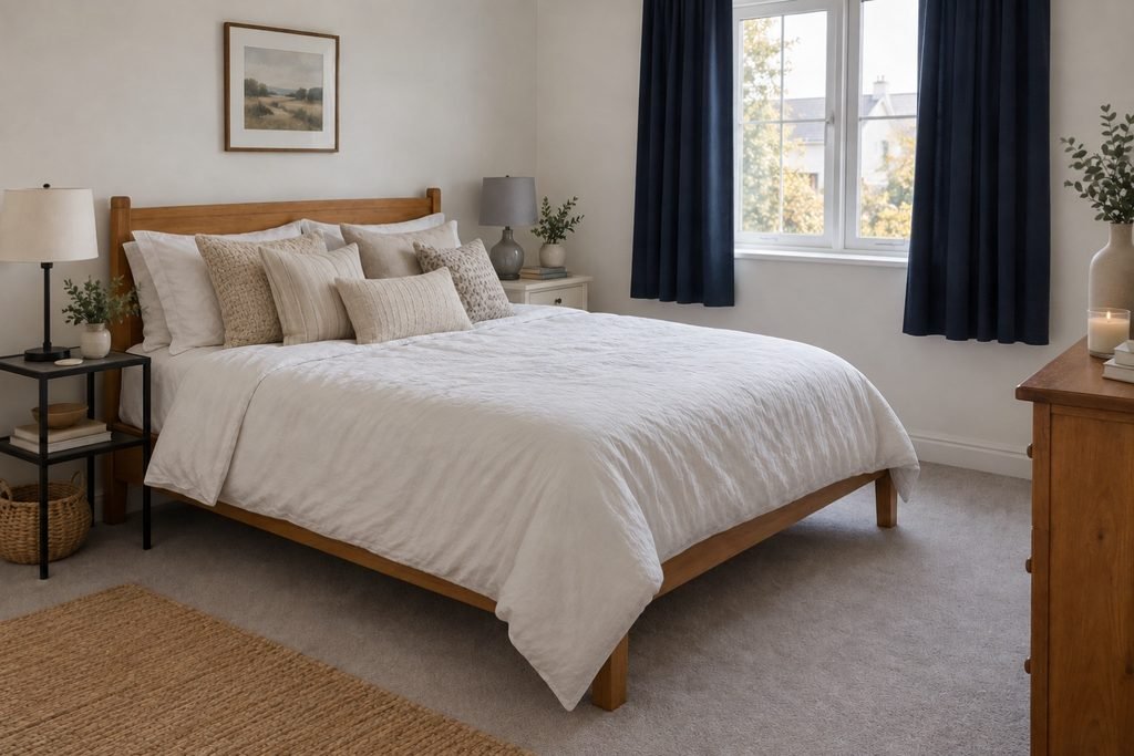
There is a honey-toned wooden bed that is still perfectly solid. The carpet is light gray. The walls are the warm white chosen by the landlord. One bedside table is black metal; the other is cream-painted wood. The navy blackout curtains do their job but stop several inches above the floor. Five beige cushions are arranged in front of white sleeping pillows, and a cool ceiling bulb makes every one of those beiges look slightly unrelated after sunset.
Nothing is ruined. Nothing quite belongs together either.
The room in this article is a composite, not a claimed personal makeover. Its details come from a very ordinary decorating problem: serviceable pieces bought at different times, a limited budget and a saved folder full of beautiful rooms that seem to require starting again.
They do not.
Rather than offering ten more quiet luxury bedroom ideas to shop separately, this article will stay with this one room from beginning to end. The bed, carpet, walls and mismatched furniture will remain. The point is to see how a quiet luxury bedroom on a budget can emerge when its decisions begin to agree—and how little “luxury” has to do with replacing everything.
Budget Bedroom Makeover: Close the Shopping List First
The imaginary shopping list is predictable: upholstered headboard, matching nightstands, larger rug, new bedding, brass lamps, boucle bench, arched mirror.
It is also closed before a single item reaches the cart.
The bed is not beautiful in the fashionable sense, but its wood is real, its shape is simple and it carries most of the room’s visual weight. Replacing it would consume the budget while leaving the cool carpet, short curtains and mixed undertones exactly where they were. The bed stays.
The carpet stays because it is clean and neutral enough to work. The warm-white walls stay because repainting a rental is unnecessary. The bedside tables stay because they are useful. The duvet insert, white sheets and framed print above the dresser stay too.
That decision changes the project. It is no longer a makeover. It is an editing job.
If a bedroom has a genuine layout problem blocked storage, furniture that prevents a door from opening or too little room to move styling should wait. Those issues belong in the separate small bedroom guide. This room works physically. What it lacks is a clear visual relationship between the things already inside it.
How to Choose a Quiet Luxury Bedroom Color Palette
The honey-colored bed has a warm undertone. The gray carpet leans cooler. Either one could lead the palette, but trying to make both disappear beneath pale cream would only produce more near-matches.
So the room needs a bridge.
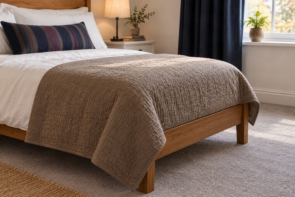
A mushroom-colored fabric is laid across the bed not purchased yet, just borrowed from another room to test the idea. Against the carpet it reads soft and gray. Against the timber it reveals a warmer brown. Suddenly the two fixed finishes look less like a disagreement.
This is the first real move in the room, and it costs nothing.
Next comes a dark note. The navy curtains already provide one, so there is no need to introduce black only because black hardware appears in polished interiors online. Navy is repeated in the narrow line of a cushion cover and in the existing framed print. Three small appearances are enough for the color to look chosen.
The room still needs a little warmth between the mushroom and navy. Muted plum is tested in a folded scarf placed at the foot of the bed. It is richer than beige but quieter than a jewel tone. The color stays in the plan; the scarf does not have to remain part of the finished room.
This warmer interpretation is not at odds with quiet luxury. Recent designer commentary on the 2026 version of the look points toward chocolate, plum and earthy reds used with cream, wood and textured fabric. The useful idea is not to copy a celebrity bedroom. It is permission to let a neutral room have a pulse.
By now the palette can be said in one breath: honey wood, mushroom, warm white, navy and a small amount of plum.
If a palette needs a paragraph to explain it, the room may be carrying too many ideas.
Three Beige Cushions Leave, and the Bed Gets Better
The five decorative cushions were meant to make the bed look generous. Instead, they hide the pillows used for sleeping and turn a large area of calm fabric into a display shelf.
Three leave the room.
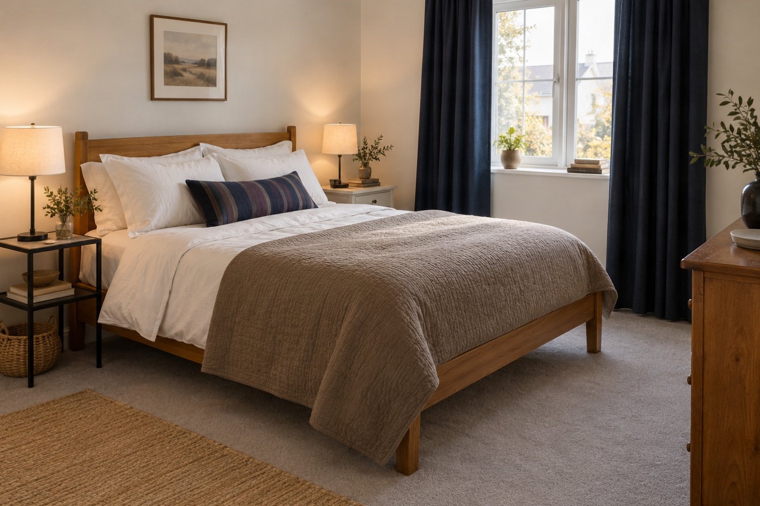
The white duvet remains because it is comfortable, washable and in good condition. It is pulled evenly inside its cover so the corners sit properly. The two sleeping pillows return to the back. In front of them, the best pair of existing beige cushions is recovered in mushroom-toned fabric. A single narrow cushion with a navy-and-plum stripe sits across the front.
At the lower part of the bed, a medium-weight coverlet introduces the same mushroom tone. It is folded broadly rather than arranged at an angle. The bed now has three visible bands: white, mushroom and one slim line of deeper color.
Nothing about that arrangement is compulsory. A person who needs more pillows should keep them. Someone living in a hot climate may prefer a light cotton layer to a heavy coverlet. Linen, cotton, velvet and wool each behave differently in use and laundering; no fabric becomes “luxury” merely because a trend report names it.
What matters here is that the bed has stopped auditioning accessories. It reads as one shape.
Only one textile is bought for this version of the room: the coverlet. The duvet, sheets, pillow inserts and two cushion covers are reused. The striped front cushion can be sewn from a remnant, recovered by a local upholsterer or replaced with an existing textile that carries the same colors. The article does not pretend one option is affordable in every country or every month.
The bedroom looks more expensive before the expensive objects arrive.
The Mismatched Tables Are Given a Family Resemblance
The black metal nightstand and cream wooden bedside table will never look like a pair. Trying to force them into one would erase the reason to keep them.
Instead, the room looks for a smaller point of agreement.
Their tops sit at nearly the same height, which already creates balance. One existing lamp has a pleated off-white shade; the other has a shiny gray shade that catches the ceiling light. The gray shade is replaced with an inexpensive fabric shade close to the first not identical, but similar in shape and softness.
The cream table receives a small navy-edged tray already owned. The black table holds a warm wooden box moved from the dresser. The materials cross over: something dark appears on the light table, and something warm appears on the dark one.
Now the tables look related without pretending to match.
The same idea connects the dresser to the bed. Its wood is slightly redder than the bed frame, so it is not “matched” with more timber. Instead, the navy line returns in the frame above it, while a cream lamp repeats the lighter bedside shade. The room develops a family resemblance through echoes, not duplicates.
This is where many budget makeovers spend too quickly. A matching furniture set appears to solve the whole room in one purchase, yet rooms often feel more personal when pieces share a color, proportion or material without sharing a catalogue number.
For renters, none of this requires attaching a permanent treatment to the building. The existing hardware stays, and anything moved can move back. More reversible approaches appear in these apartment decor ideas.
Warm Bedroom Lighting: The Problem Daylight Hid
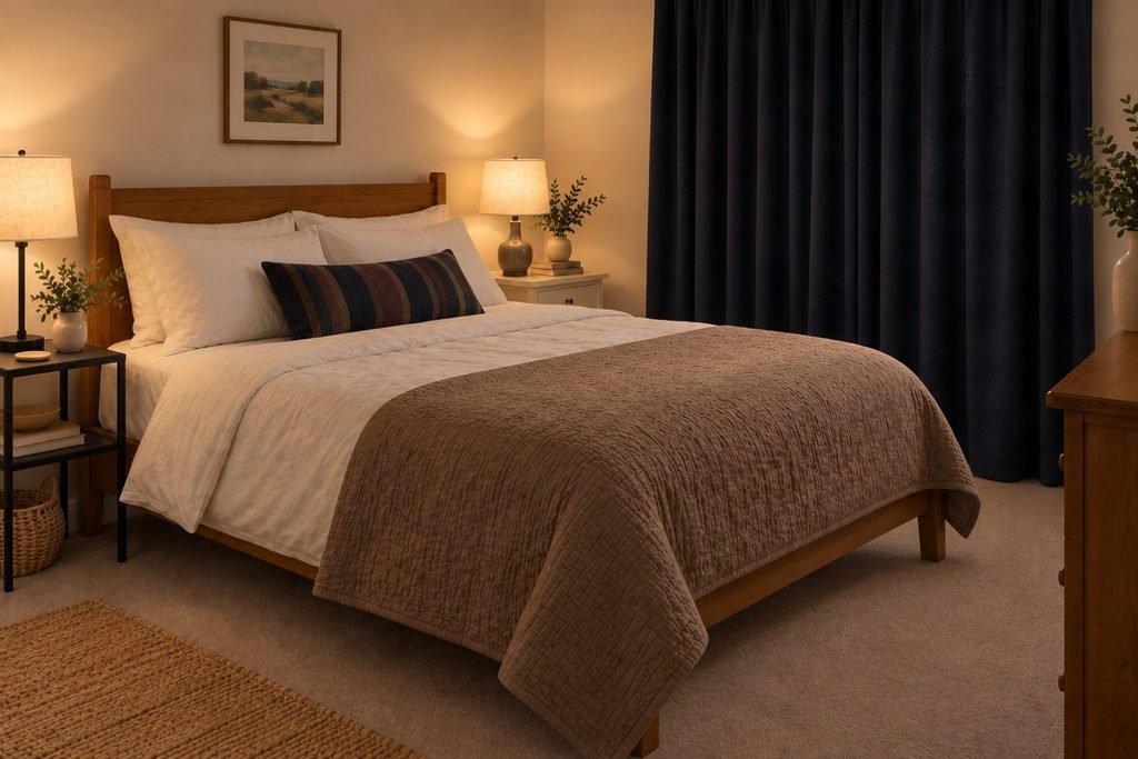
In daylight, the revised palette is convincing. At night, the cool ceiling bulb washes the warmth out of the timber and turns the mushroom coverlet gray-blue. The two bedside lamps are warmer, but one is much brighter than the other.
The colors are not failing. The light is changing their relationship.
The ceiling bulb is replaced with a compatible warm-white option. The bedside bulbs are changed so their color appearance and brightness are closer. Around 2700K generally appears warm; 3000K looks a little clearer. The number is a useful comparison on packaging, not a rule every bedroom must obey. The fitting, shade and wall color will alter what the light looks like in the room.
No extra light strip is hidden behind the bed. No decorative lamp is added merely to fill a corner. The existing three fixtures are enough once they stop contradicting one another.
Electrical details are treated as functional, not decorative. Bulbs must suit the fixture rating, damaged cables should not be disguised, and extension leads should not be connected to one another. Electrical Safety First explains how socket and extension ratings relate to overheating risk. Any hard-wired change belongs with a suitably qualified professional.
The room is now softer after dark, but more importantly, it is still the same room. Lighting has revealed the materials instead of trying to become the main feature.
The Biggest Purchase Was Almost a Bench
The saved inspiration images nearly win at the foot of the bed.
Many of them include a bench: upholstered, softly curved, often carrying a carefully folded throw. In this bedroom, a bench would narrow the gap to the dresser and provide another surface for clothes. It would solve a photographic expectation rather than a real problem.
The bench stays in the shop.
So does the arched mirror. There is already a full-length mirror inside the wardrobe door. A second one would repeat a function and introduce another large shape the room does not need.
The money is redirected toward the curtains, because they are the one part of the room that still looks accidental. The navy color suits the new palette and the blackout lining is useful, but the panels end too high. If matching fabric can be sourced, a competent alteration could add a deliberate lower border. In this version, correctly sized navy panels are the cleaner choice, and the old pair can move to a shorter window elsewhere.
They are measured from the existing hanging point rather than ordered from the dimensions of the glass. The new panels meet the floor without gathering heavily on it. They cover the window fully when closed and stack far enough aside to avoid stealing unnecessary daylight when open.
That is the largest spend in the room. It earns the position because it corrects scale, preserves privacy, controls light and repeats the darkest color in the palette.
A budget is better protected by one purchase with several jobs than five accessories with none.
One Object Is Allowed to Break the Scheme
The dresser originally held a candle, two beige vases, a stack of unread display books and a small artificial plant. They were all “right” for the style, and none gave the room a reason to be remembered.
Most of them leave.
The warm wooden box remains because it is useful and has already helped connect the furniture. Beside the lamp sits one framed photograph in a deep burgundy mount. The color is slightly stronger than the planned plum accent. That imperfection is welcome.
Quiet luxury becomes dull when every personal object is rejected for failing the palette. A room can survive a bright book cover, an inherited ceramic dish or a photograph taken somewhere meaningful. In fact, one honest interruption often makes the careful neutrals around it feel more convincing.
The photograph is not described as an investment piece. It does not need provenance. It belongs because someone chose it for a reason other than filling space.
The dresser now has fewer objects but says more.
Quiet Luxury Bedroom Before and After: What Actually Changed
The walls are still warm white. The carpet is still gray. The honey-toned bed, mismatched tables and existing dresser have not been replaced.
The difference begins with the mushroom textile that bridges the warm timber and cool floor. Navy has moved from being an isolated block at the window to a thin repeated line around the room. Plum prevents the scheme from becoming cautious. White bedding gives the bed breathing room, while the coverlet gives it weight.
At the sides, the furniture remains visibly different, but related shades and crossed-over materials make the difference look collected rather than temporary. After sunset, the bulbs agree. At the window, the new curtain length looks deliberate. On the dresser, one personal image has replaced several objects selected only for their color.
This is a quiet luxury bedroom on a budget, but it is not a budget copy of a luxury suite. It has no theatrical reveal because the result comes from continuity. The familiar pieces look better once the room stops asking each of them to speak a different language.
The final purchases were limited: a coverlet, a small piece of fabric or one cushion cover, a lampshade, compatible bulbs and properly sized curtains. Depending on what a reader already owns, even some of those would be unnecessary. No fixed total is promised because fabric, labor and home-goods prices differ between the US, UK and everywhere else and because “affordable” changes from one household to another.
Renter-Friendly Quiet Luxury Bedroom Ideas You Can Adapt
Copying the finished palette would miss the point.
If your fixed feature is a black upholstered bed, black is already the room’s deepest note; you may need warm oak or tobacco rather than navy. If your carpet is brown and the wardrobe is white laminate, a putty-colored textile could connect them while olive supplies depth. If your rental walls are yellow-toned magnolia, bright optical white may make them look dingier; oatmeal and faded blue may cooperate more easily.
The colors change. The logic remains.
Keep the strongest serviceable element. Find the finish it is arguing with. Place a bridge color between them. Repeat one deeper note in a few controlled places. Let the bed form a clear shape. Make unlike furniture share one visible quality. Spend on the unresolved edge, not the fashionable extra.
That is not a ten-product formula. It is a way to make decisions without erasing the room you already have.
For broader, buy-later decorating choices, continue with these budget home decor ideas. If you want the same room to change gently with the seasons, the fall home decor guide shows how a stable foundation can carry smaller temporary layers.
The Sentence That Ends the Makeover
Before buying the final object, describe the room without naming a trend.
For this one, the sentence is: warm timber, soft stone fabric and a narrow line of navy around a bed that is meant to be used.
The sentence leaves room for the gray carpet, cream table, plum cushion and personal photograph. They support the idea without needing to appear in its headline.
If your sentence contains six styles, four colors and three moods, the room is not asking for another purchase. It is asking for an edit.
When the sentence becomes clear, stop. The empty part of the dresser can stay empty. The furniture does not have to match. The bed does not need one more cushion.
The room was never waiting to become expensive. It was waiting for its existing pieces to belong to the same story.
Save this case study for the next time a shopping cart begins to look like a design plan, and follow New Premium Picks on Pinterest for bedroom palettes and visual references.

2 Comments